After Vasari

writings on artists and artworks and where they exist

Month: January, 2013

Gallery visit: Sharon Butler at Pocket Utopia

by A.L. McMichael

Sharon Butler, "Blue Fences," 2013. Pigment and silica binder, staples on laundered linen tarp, 16 x 18 inches. (Photo courtesy of the artist and Pocket Utopia)

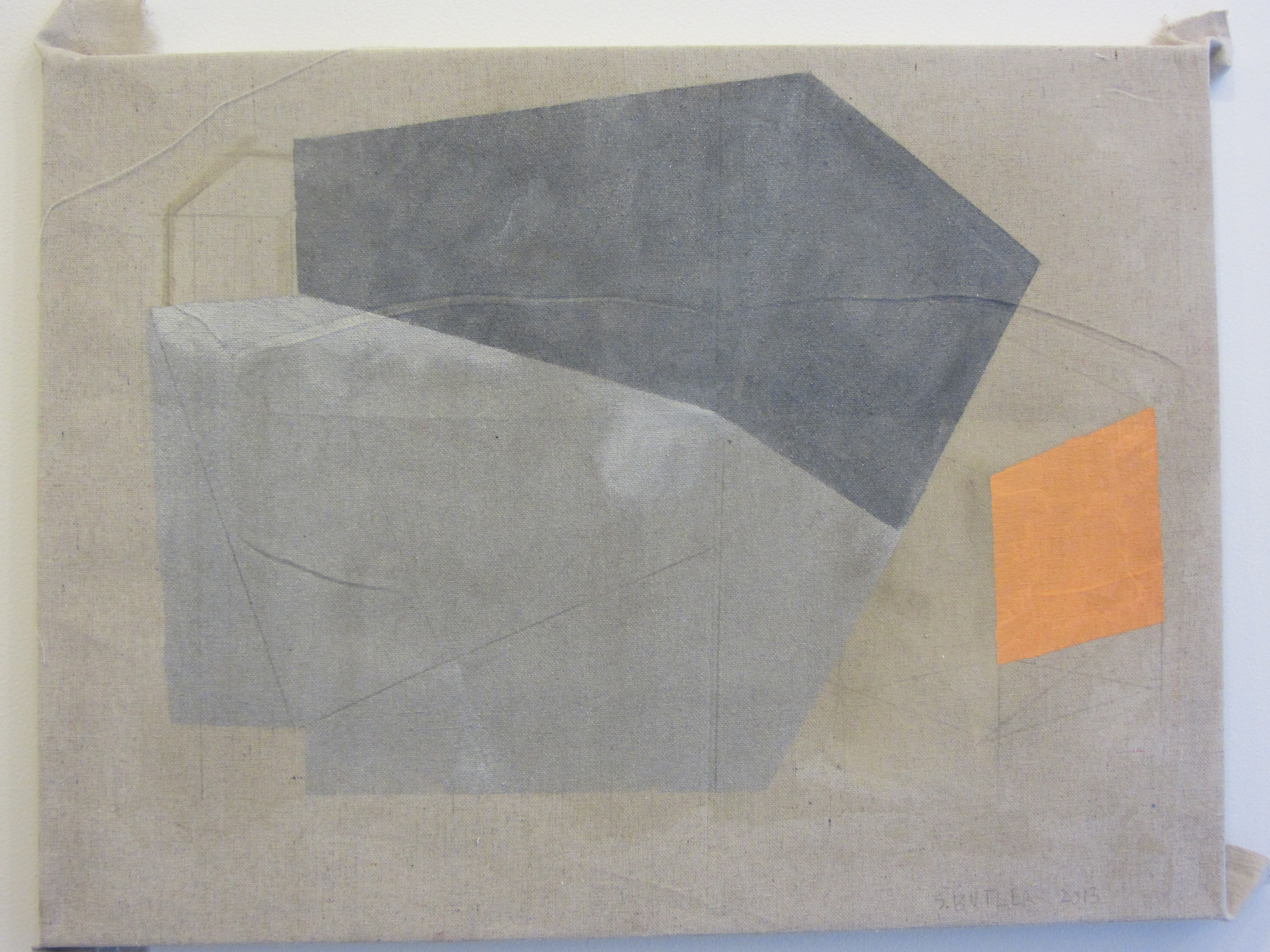
Sharon Butler, “Blue Fences,” 2013, Pigment and silica binder, staples on laundered linen tarp, 16 x 18 inches (photo courtesy of the artist and Pocket Utopia)

Last week I snagged an invitation to a small gathering of art appreciators at Pocket Utopia and had a chance to chat with Sharon Butler, whose solo exhibition, “Precisionist Casual,”  will be open there until February 17, 2013. Several people in our group commented on the colors Butler uses throughout the show—deep terracotta pink, muted tangerine and teal, and shades of grey painted onto linen canvases of pumice and beige. Quietly active and sophisticated, the color palette manifests itself in a series of paintings consisting of shapes that are mostly geometric. They demonstrate that the artist is, in fact “drawn to urban settings, structures, and HVAC architecture,”  as promised on the Pocket Utopia website, yet the linework maintains a handmade line quality.

Just before we dispersed, I commented on the shimmery, grey paint that appears throughout the exhibition. Butler responded that it functions like the mineral sparkle we see in sidewalks on a sunny day. It certainly does have that effect in paintings like Blue Fences and Soaked (Hurricane). But for me it was also a reference to the pipes and steel beams that make architecture a three-dimensional creation. It is as if the reflective paint could be a visual shorthand for ‘metal’ and the negative spaces that sculptural and architectural creations surround. This is further emphasized by the relationship of the canvas that is frayed and stapled to the front of the stretcher, which Paul D’Agostino calls a concatenatory teasing of materials and dimensions. Butler’s display is a gentle step away from the two-dimensional paint on canvas, but one that provides an easy mental leap to built spaces. On Sunday I read Tom Micchelli’s interview with Butler in Hyperallergic Weekend; he also comments on the metallic paint and likens her work to sculpture, noting particularly that the colors in Underpainted HVAC are remniscent of a “dusty, rough-hewn limestone slab.”

Sharon Butler, "Soaked (Hurricane)," 2013. Pigment and silica linen tarp, 18 x 24 inches. (Photo courtesy of the artist and Pocket Utopia).

Sharon Butler, “Soaked (Hurricane),” 2013, Pigment and silica linen tarp, 18 x 24 inches (Photo courtesy of the artist and Pocket Utopia)

The graphite color also conjures up mental images of pencil sketches, of motions creating quick linework, making a gestural statement on flat paper. Some days I can’t stop being a Byzantine scholar, particularly when musing about that link between color and motion. Today, this shimmery paint bridges the gap between contemporary art and medieval mosaics. Art historian Liz James has written about the medieval Byzantines’ use of gold and gems in art—the shimmer activated spaces; reflections of light made the viewer feel as if the space between him and the art was full of energy, drawing him into the image and providing a link to a mystical, heavenly realm.

What’s interesting here is that for both Micchelli and me, Butler’s use of color brought forth connotations of three-dimensionality. That ‘color psychology’ is a nebulous term (and a concept that varies wildly between cultures and individuals) in no way negates the fact that color and emotion are intertwined—we often think of color as an artist’s choice that sets a mood or sends a message. I’d like to emphasize, though, that it’s not just hues but attributes of color—opacity, depth of tone, reflectiveness, (yes, shimmer)—that engage us. Viewing art creates an energy, and the urban quietude of Butler’s canvases harnesses it in a colorful experience that is thought-provoking without resorting to kitschiness or snark.

Essay: Wheatpaste Touchstones

by A.L. McMichael

SAMSUNG DIGITAL CAMERA

A wall painting (artist unknown) above Kjosk in Kreuzberg, Berlin.

I spent the summer before last poking around Berlin with Matt, my boyfriend/partner/partner-in-crime. He was researching a novel while I studied for an impending exam in Byzantine art history. Almost everyone around me was bilingual, making me feel half as literate, a humbling and disconcerting notion for a graduate student. I could muddle through street signs and menus but could only converse in English, making my relationship with the people and spaces more visceral—one of hand gestures, written signs, objects.

Images inevitably became my touchstones, the elements of daily life that I remember most vividly. While my budget was too humble for frequenting Museum Island, and the occasional artists’ squat had signs saying, “tourists fuck off,” (thereby inflaming my introverted tendency to feel unwelcome in unfamiliar spaces), there were colors and texts and images sprayed and plastered and painted onto every block, the visual tone of an unfamiliar city. I’ve written elsewhere about the now-defunct Kunsthaus Tacheles and graffiti, so much a part of Berlin, and about the Bode Museum, a haven of medieval art nestled onto Museum Island. But it is the street art that gave me a sense of place in my temporary home. The large murals and wheatpaste images were a sort of bridge between the architecture and people in it. Even from afar, these public images highlight the ways we mediate concepts of both time and space, of public and private, permanent and ephemeral, legal and subversive, beautiful and unsettling.

Kjosk is a bar that serves cans of beer from a parked trailer in an empty lot in Kreuzberg. Soaring above it is (was?) a large mural in progress that served as a favorite landmark. Come to think of it, I have no idea why a dangling, headless beast hanging under, “Love art hate Cops” would have a positive connotation in my memory bank. Perhaps it was the beers sipped on a breezy evening at the plastic table under its towering presence. Maybe studying the monstrous oddities of medieval marginalia have upped my tolerance for the non-beautiful. Either way, there’s an element of mystery in the art. It holds the essence of daring. How’d they get up there? Was it legal? How long will it last? Is it finished?

I suppose we could make some statement about the human connection inherently made by images, or the role of color in mediating a brick-and-mortar architectural environment. While we’re at it, familiarity and recognizability are a form of comfort, of security. Sensibilities aside, the wall is a canvas extending into our three-dimensional reality, integrating itself into the space inside the cafe and projecting the image far beyond the building or the block. The dangling beast is soaring—negotiating visual, psychological, and urban space.

Klone, "Don't Sleep." Berlin, 2011.

Klone, “Don’t Sleep.” Berlin, 2011.

On my last bike ride in Berlin, I stopped to take a closer look at an image tucked beneath an overpass. Pasted to a pillar was a figure with dark-rimmed eyes, holding a crying paper boat, drifting and dripping in a sea of blue. This was my cue to read up on wheatpaste art and to continue noticing just how much of it papers the urban fabric of my city, of many cities.

Later that summer in Fort Greene, Brooklyn, a line art image of a boy emerged from the chipped surface of a stoop.  On that particular day I was terrified by my bike’s malfunctioning gear system and relieved from having just dodged the wrath of Hurricane Irene. At a time of heightened awareness, I was haunted by the wheatpaste figure and his reflection in the nearby glass door. Kneeling yet floating, the boy and his reflection haunted me for weeks until I found his twin pasted near the Gowanus canal.

Brooklyn-20110821-00164

Swoon, “Emmett.” Fort Greene, Brooklyn, 2011.

I’ve watched the Gowanus wheatpaste boy gradually disintegrate into the fiber of Brooklyn. Snow storms, spray paint, and another hurricane have made it an evolving benchmark. My most recent visit was the day after Hurricane Sandy. Sump pumps were draining basements nearby and the air was heavy and grey. The boy was still kneeling on sidewalk detritus, his torso a ghostly outline palimpsested between layers of paint. The delicacy of something so bold and powerful exposed to the elements is the embodiment of change, of the cycles of time passing in my neighborhood.

The relationship we have with art and our surroundings feels so internal and yet is entirely public. A quick Google image search brought the disconcerting realization that the unobtrusive art I “discovered” on my bike ride in Berlin is by Klone. Naïvely, I was astounded that the street art I loved and considered such a personal discovery is by an internationally known artist with an online store. A stranger’s blog post shows a later incarnation of the Berlin beast, with a head and dangling companions. The Fort Greene and Gowanus wheatpaste boys are by Swoon, who apparently has a studio nearby.*

I was almost embarrassed to find that my quirky visual affinity for street art is commonplace, but its hints of subversiveness pique our collective interest. Street art mediates our sense of place; it documents the changing nature of our surroundings and provides a backdrop for daily life, occasionally asserting itself into the foreground of memories and events.

*n.b. Thanks to Ben Sutton for helping me identify Swoon’s work. If you know who created the Berlin mural, please leave a comment; we’d love to give them credit in the caption.