After Vasari

writings on artists and artworks and where they exist

Embodiments

by Paul D'Agostino

avec1

Embodiments: Exquisite Corpse
Exhibition essay by Paul D’Agostino for M. David Studio Residency

The culmination of weeks of planning and a ten-day, intensive on-site period of residency in Brooklyn, Exquisite Corpse will amount to a collective installation of works by Deborah Kapoor, Winston Mascarenhas, Bonny Leibowitz and Francesca Schwartz, all of whom find inspiration in various understandings and expressions of the body, and of bodies. This is a subject they examine and represent with marked abstraction, in visual terms, and conceptually as something internal, external, protean and interactive — and as the means for and locus of invasion and trauma, healing and recovery, stillness and grace.

The layout that curator and residency director Michael David currently envisions for this exhibit of ambitious new works by all four artists is based to some extent on counterbalances and junctures, perhaps not unlike certain aspects of bodily structures themselves. This should be considered in material as well as conceptual terms, not least with regard to how the four artists’ works will be spatially though somewhat casually paired: two artists will be installing their pieces primarily in the gallery’s front area, the other two toward the back. On the one hand, the idea is to create two separate spheres of bodily or meta-bodily expressions; on the other hand, it is to see what kinds of unexpected equilibrium might be attained as a result.

avec22.JPG

Filling in and encircling the gallery’s front space with airs of dynamism and spareness will be projects by Deborah Kapoor and Bonny Leibowitz, who have been working with one another’s pieces in mind without necessarily reacting to them. Working now in a minimalist, whispery palette, and with a set of materials somewhat new to her, Leibowitz will complete a sequence of sculptural works hanging from the ceiling. Delicate, airy and slightly astir, Leibowitz’s works will suggest internal tissues and physiological networkings, or perhaps extra-bodily transplants or spiritual emissions. Kapoor, meanwhile, taking cues from birds’ flight patterns and readings thereof, is planning to complete an array of small, variably abstracted, heavily mixed-media wall sculptures intended to surround, perhaps somewhat scavenger-like, Leibowitz’s pendant pieces. Small individually yet imbued with material gravity, Kapoor’s works will cohere with one another visually as a circling flock of abstract objects, or as a composite body composed of an array of bird-like bodies.

Francesca Schwartz and Winston Mascarenhas will present 2D and 3D works that explore notions of the body in ways both far more literal and markedly more abstract. In an extensive suite of variably sized mixed media paintings on handmade composite panels, Mascarenhas will encourage viewers to look at and consider not a body, but our bodies, hoping to communicate how so many of our corporeal and identity-related trappings make us all quite the same, while also individuating us within the very same sameness. In other words, he’ll be creating a series of textures and hues suggestive of our organs — large and small, internal and external — such as our hearts and, primarily, skin. As a retired physician, Mascarenhas certainly knows a thing or two about how we’re all made of the same stuff, and about how our hearts, the things that truly make us tick, were never designed to house the harmful biases that we might harbor in our minds. A practicing psychoanalyst, Schwartz certainly knows a thing or two about how and why we come to greater or lesser understandings of ourselves as individuals, and about how experiences of pain, trauma, anxiety and grief can inflect, inform, confuse, inhibit or enhance these same understandings. Although Schwartz brings a wealth of clinical expertise to the planning of her works, she tends to eschew any imaginable clinicality of style or approach in her assemblage-heavy pieces that incorporate photographs, texts, textiles, and a range of drawing and painting media as well as — since she’s also trained as a butcher — bones. Schwartz will present several manifestations of all such types of work.

avec33.JPG

A great deal of new art is being made for Exquisite Corpse. A great deal more has yet to be made. Soon it will all come together in the same space to be completed, tweaked and reworked. We’re all eager to see how the envisioned counterbalances and junctures take shape as an exhibition. And of course, we’re very eager to share all of these results with you.

________________

This essay was composed for Exquisite Corpse, an exhibition produced by M. David Studio Residency. It was on view from 9/28/2018 – 9/30/2018 at 56 Bogart Street in Brooklyn, New York City.

Paul D’Agostino, Ph.D. is an artist, writer, translator, curator and professor living in Bushwick, Brooklyn. More information about him is available here, and you can find him as @postuccio on Instagram and Twitter.

Scrims & Blurs

by Paul D'Agostino

RU-Collage

Scrims & Blurs: Theresa Volpp, Mads Lindberg, Kinu Kamura, Julie Leidner
Curated by Paul D’Agostino for Residency Unlimited

Hosted by El Museo de Los Sures, and featuring current Residency Unlimited artists Kinu Kamura (France), Julie Leidner (USA), Mads Lindberg (Denmark) and Theresa Volpp (Germany), Scrims & Blurs presents a navigable pathway of paintings, drawings, sculptures, collages, photographs and partially site-specific installations. It’s an exhibition that invites visitors to look at, into and through a variably interactive array of objects while pondering notions of blurry translucence, reflective transparency, dematerialization and rematerialization, and self-refraction and self-discovery. In ways active and viewer-activated alike, the carefully considered surfaces of all of the works — layered materially as well as conceptually — serve as sieves and concealers, revealers and obscurants. Behind their textures, filters, scrims and screens lie clues, secrets and discoveries.

Broad and expansive like a sprawling tapestry, Theresa Volpp ‘s multi-panel mixed-media painting on transparent vinyl is an amalgam of gestural, energetic, and at times frenetic marks and layered applications involving household paint, ink, glitter and spray paint. Her treatment is thin yet chunkily abstract in formal ways. Her palette is deep yet punctuated by vibrant yellows. Transparency lies beneath her materially complex surface, but it’s all but hidden. Your act of seeking it out then becomes exploratory; locating its ulterior surfaces is thus excavational.

Hidden in Mads Lindberg’s sequence of mixed-media paintings, meanwhile, is neither transparency nor translucence, but rather various forms of representation. What Lindberg hides, in other words, is paintings or other kinds of imagery that he finds and repurposes, intervening with his own additional marks and forms. These already somewhat hidden works are then hidden even further behind scrims, as it were, of not only resin, but also an additional ‘outsourced’ layer of a different sort: plastic shopping bags. Lindberg’s implicit commentary on the cyclical nature of the trappings of commerce thus runs from the surface to the core of his works.

Julie Leidner, working in parallel on two interrelated bodies of work featuring a common protagonist — a possibly timid, possibly audacious, possibly fearful, possibly fearsome, perhaps even feral young girl the artist identifies as ‘Pebbles’ — has created a series of small paintings on canvas and a suite of larger paintings on paper. Both bodies of work involve not only overtly differentiable layers of paintings, but also of cultural and historical interpretability. In the smaller works, Pebbles is identifiable behind visual sieves of text that that read, to various extents and in various forms, “Dirty ain’t I?”, a cryptic question that seems as if someone wrote it with a finger into caked-up dirt on a car window. Here, Pebbles peers out of the paintings to see not only the ‘filthy’ messaging, and not only her real and implied ‘viewers,’ but also herself. In Leidner’s other body of work, “I Come Creeping,” one large representation of Pebbles crawls across and atop several large sheets of glossy paper, each proportioned like Playboy centerfolds, and each featuring — behind ‘pieces’ of a ‘creeping’ Pebbles — a very differently formal oil rendering of a rural landscape. Here, history meets mystery, and Leidner’s bodies of work look back and forth at one another while we, the viewers, become an additional ‘scrim’ of complicit voyeurs.

Kinu Kamura’s work is all about additional scrims and layers of looking. Inspired by levels of clarity and blur in our own acts of seeing, and by ideas of experiential and spatial reproduction, reflectivity and transference, Kamura has created an ultimately site-specific, multi-piece sculptural installation that invites visitors to look at, into and through it. Her broadly scaled and spatially expansive objects, to some extent a ‘bridge’ between the front gallery and the back, are composed of various types and formations of plexiglass and other reflective, refractive, sight-altering surfaces. Viewers thus see themselves as they look through such pieces, while seeing also manifold layers of reflections of the works in the room. The room, of course, becomes an active part of the work and ‘act of seeing’ as well: it is the site, and it is also ‘in sight.’ The frame-within-a-frame modality of Kamura’s work doesn’t quite end there, however. She incorporates choice photographs and photocopies as well, some nodding directly at the space itself, and others to other works in the show. Residing in our eyes for a time, Kamura’s labyrinth becomes infinite in our minds.

Scrims-and-Blurs-1Scrims-and-Blurs-2Scrims-and-Blurs-3Scrims-and-Blurs-4Scrims-and-Blurs-5Scrims-and-Blurs-6Scrims-and-Blurs-7Scrims-and-Blurs-8Scrims-and-Blurs-9Scrims-and-Blurs-10Scrims-and-Blurs-11

________________

The above text was composed for Scrims & Blurs, an exhibition produced for Residency Unlimited. It was on view at El Museo de Los Sures in Williamsburg, Brooklyn, from 19 to 28 July, 2018. More information about the show can be found here. Photographs by Paul D’Agostino.

Paul D’Agostino, Ph.D. is an artist, writer, translator, curator and professor living in Bushwick, Brooklyn. More information about him is available here, and you can find him as @postuccio on Instagram and Twitter.

Manual Realizations

by Paul D'Agostino

Screen Shot 2018-05-15 at 6.26.06 PM

The Safety Net, mixed media collage, 2015

Manual Realizations: Leslie Kerby’s The Laying On of Hands

Working always deftly and fluidly among a full range of image-making techniques, including drawing, painting, printmaking and collage, and recently adding sculpture and animation to her practice as well, Leslie Kerby creates all manner of visual narratives addressing, with a keen critical eye, societal practices, ills, curiosities, complexities, services, interactions and constructs. With palpable sincerity and a sense of humor, she has addressed many facets of our politically circumscribed, socioeconomically determined or determinable lives, from the neighborhoods we live in to the ways in which we attain our goods and services, from the ways in which we communicate with one another to the cemeteries where we might visit or bury our loved ones. Kerby has never shied away from handling even the most controversial or aesthetically challenging themes. Indeed, the most difficult ones sometimes become the greatest conduits for her creative impulses.

This is certainly the case with The Laying On of Hands, one of Kerby’s most recent and materially polyphonic bodies of work. Here, the artist turns her critical eye towards one of the most politically charged, ideologically divisive, societally expansive and, at the very same time, most deeply intimate issues of our time in the United States: our healthcare system. Kerby began contemplating this as subject matter six or seven years ago, having personally experienced, endured or witnessed no shortage of the good and bad of how we insure ourselves for and possibly receive medical care. She knew that, in a few ways, the system worked well enough. She also knew that, in many ways, it was direly inefficient, unnecessarily confusing and, for far too many people, devastatingly lacking. Given the issue’s gravity and complexity, however, Kerby spent several years moving forward with other projects instead, all the while pondering how she might effectively convey her thoughts about the precarious, indeed fundamentally perilous state of our healthcare system in ways that would be both visually engaging and candid in commentary.

Screen Shot 2018-05-15 at 6.23.58 PM

Blanket Coverage, mixed media collage, 2016

Kerby’s solution turned out to be simple and inclusive. She decided that works on paper with graphic immediacy would constitute the body of work, and that each work would itself be constituted by imagery produced via essentially all of her manual skills as a maker of imagery. In a way, just those few decisions are already striking analogs for what our healthcare system is definitively not, and what or how it could or should be: it is neither simple nor inclusive, but it certainly ought to be; aspects of it that might be conceptually plain are presented in ways that confound everyone, from doctors to patients and customer service agents; many of the system’s verbal convolutions are surely intentional, masking fees and exceptions in footnotes and conditional clauses; people at various income levels, especially the lower ones, as well as people who might already be sick are left out of the system entirely, or they are gravely underserved, meaning underinsured; and the system overall feigns personalized service while remaining pitilessly impersonal, removed, uncaring. Unfortunately, these are not new problems at all with regard to how healthcare in our country is provided, nor are they new in terms of how it is presented in our political discourse. Yet they are problems that have never gone away, and that seem to become worse as medical technologies advance, and as masses of data come to define patients and problems in general, statistically, rather than determining an individual patient’s problems specifically. This should seem absolutely paradoxical. It absolutely is.

How, then, do Kerby’s works convey something simpler, more inclusive, more comprehensible and intimate? How are the obvious levels — for they surely are obvious — on which our own lawmakers and doctors should demand — for they surely should demand — improvement from our ‘service providers’ made manifest in The Laying On of Hands? It couldn’t possibly be more genial or straightforward. Kerby conveys her commentary by crafting individually identified or identifiable patients and doctors, sometimes interacting with one another, sometimes only almost, and she does so by doing, as an artist, precisely what doctors have always done, and what so many of them still want and are trained to do: employ their full range of diagnostic reasoning and manual skills to care for one patient at a time, one ailing person at a time, as meaningfully and holistically as they can. Kerby achieves both ideals by tapping into the full extent of her creative skill set, employing several very manually driven processes of drawing, printmaking, collage and image transfers, among other approaches, to create variably pictorial contours and silhouettes of patients now ailing, now under examination, now being medicated, now ostensibly becoming their medications. Visages and figurations, and most certainly the omnipresent motifs of hands and eyes, predominate these engaging compositions in which pills, simplified x-rays and pieces of equipment factor as well, with backgrounds generally left blank or spare. In a formal sense, per her clear sources of inspiration and characteristic treatments, Kerby’s yields are images of great candor and immediacy, aesthetically steeped in various elements of German Expressionism and, with very fitting specificity, Neue Sachlichkeit — indeed, one might even identify in Kerby’s collages a rather seamless merging of the two readily distinguishable traditions, the latter’s germaneness here not incidental given the medical nature of some of its most historically trenchant imagery.

Screen Shot 2018-05-15 at 6.18.56 PM

The Dispensary, mixed media collage, 2015

On that note, Kerby, with perhaps a knowing nod to Christian Schad’s The Operation, makes her doctors, nurses and medical settings very easy for us to recognize. But how to recognize a student or a journalist, a chef or a plumber? Kerby identifies her protagonists in her very own handwriting, their facial features often well delineated, their attire or other accoutrements pointing to their trades or occupations. What do we know of their ailments? We see where they are ailing by way of where she places their pills within their figurative contours, with their medications sometimes taking the shape of objects relative to their professions: the librarian’s pills are spread across two pages of an open book; the banker’s are arrayed in a way that suggests coins; the musician’s are shaped like a guitar; the lawyer’s medications quite meaningfully sit atop the plates of a dramatically unbalanced scale of justice. How to keep viewers engaged in a suite of societally critical, even perhaps thematically somber works might seem an additional concern, but Kerby has cleverly foreseen that, undercutting the potentially overwhelming gravity of her subject matter — who will listen if it’s all pain and trauma, or keep looking if it’s all shock and awe? — by intermittently cartoony renderings, exaggerated embellishments, caricatured features and physiques, and even a certain kind of mirthful array in her arrangements.

Seriousness and humor come into most succinct and critically significant confluence in works like The Dispensary, in which a doctor and two nurses are portrayed as busts atop Pez candy dispensers, and in Candyland, in which the artist reconfigures many of the characters and formal tropes from her entire body of work into a loosely rendered representation of the eponymous board game for kids. Kerby’s critique here is at once precise and expansive: while the game is intentionally structurally misleading, so to speak, and indirect and obfuscatory in the sweet, felicitous interest of childish fun, our healthcare system is all of the same, and then some, in the bitterly sickening interest of corporate greed; and while the composition and visuals indicate a game for kids, they also suggest the hardly outlandish notion that insurance providers and pharmaceutical companies, assuming that we’re all manipulable and naïve, are playing a game with our bodies and minds. A form of casual entertainment for children, here, is simultaneously legible as a system of physical and psychological entrapment for adults.

Screen Shot 2018-05-15 at 6.22.00 PM

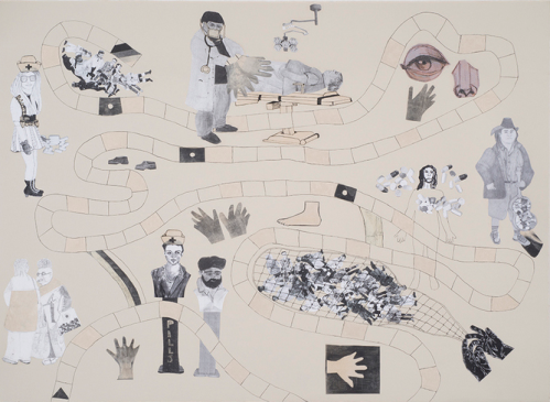
Candyland, mixed media collage, 2015

This kind of duality is also present in Kerby’s ultimate addition to The Laying On of Hands, a video animation, made in collaboration with designer Lianne Arnold, in which the full set of collages undergoes, or even performs on itself, a kind of surgery, autopsy or anatomical investigation. Here, by laying her hands back onto or into her body of work, she quite literally quickens it, sets it into motion. Now her compositions come alive and interact with one another, and pieces from one wander about from one spot to the next, from one collage to the next. In this animated context, however, the child/adult duality Kerby implies in Candyland is essentially inverted. Now, a system that is often entrapment for adults becomes, in a delightfully rendered ‘cartoon,’ something that could readily entertain children. It’s hard to overstate the importance of Kerby’s dual modes, or even dual moods, in this thoroughly considered body of work. On the one hand, they help her engage viewers more broadly and permit certain aesthetic freedoms, from ‘fun’ images like candy dispensers to a rather graphically lighthearted animation. On the other hand, Kerby’s dualities also relate quite plainly to the great paradox of our healthcare system overall — that the very form of ideally pathos-driven, human-to-human interaction that should be most intimate, personalized and hands-on so often seems, thanks to corporate avarice and legislative apathy, as insensitive and impersonal as can be.

By tapping into so many of her artistic skills, sources of inspiration and critical modes in the creation of The Laying On of Hands, Leslie Kerby has crafted one of her most fully realized, conceptually seamless bodies of work to date. As you follow the trajectories of figures and forms from one mixed media collage to the next, and from the suite of collages to her video animation, you can’t help but find yourself in agreement with both sides of her implicit claim: staying alive and well truly should not be a roll of the dice, yet what our ailing healthcare system has let it become is a baffling game that toys with our lives.

________________

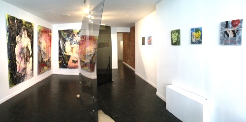
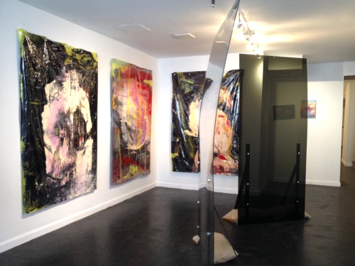
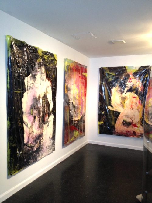
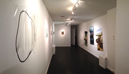
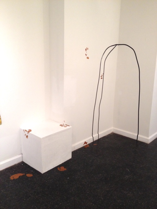
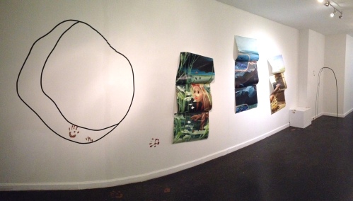
This essay was composed for the catalogue accompanying The Laying On of Hands, Leslie Kerby’s solo exhibition at Project ARTspace, located at 99 Madison Avenue in New York City. The show will be on view from 16 May to 15 June, 2018. More information about the show can be found here. Images courtesy the artist.

Paul D’Agostino, Ph.D. is an artist, writer, translator, curator and professor living in Bushwick, Brooklyn. More information about him is available here, and you can find him as @postuccio on Instagram and Twitter.


Discoveries & Wonderings

by Paul D'Agostino

Screen Shot 2018-05-03 at 4.19.52 PM

Petra Nimtz, No Strings Attached #1, 2017

Discoveries & Wonderings: New Paintings by Petra Nimtz

There are paintings that show you subjects. There are paintings that show you things. There are paintings that lure you into seeing figures, places, colors, shapes, textures, lines and objects. There are paintings that show you worlds and realms. Petra Nimtz’s paintings, at one level or another, show you various sorts of all such things. Yet that which you see, and the manner and moment in which you come to see it, are the very things this process-driven painter prefers to imply rather than firmly determine. Her compositions are places for you to see into, discover and wonder.

You might see, for instance, at center left, and quite immediately as you regard No Strings Attached #3, a slatted door of curious sorts, one that seems to have been left open in a second floor bedroom in a placeless home of peculiar proportions. Unless what you see, that is, while looking at the very same trapezoidal form — the one whose white center is lined with delicately rendered, blind-like horizontal striations, making its lavender framing scan as a spatially recessive ledge or sill — is a window. If so, then the implied interior becomes very strangely mysterious. Its dimensionality begins to budge just a bit, and a kind of phantom light seems to take shape at center right, which then makes that chain-link-like form floating into the space from the edge of the canvas appear intriguingly apparitional, observant, vaguely figural.

Screen Shot 2018-05-03 at 4.18.02 PM

Petra Nimtz, No Strings Attached #3, 2017

By now, of course, you’re locked into your act of looking, and then you begin to wonder: What’s that red portal? Where might it lead? Is that soft grey area the shadow of a window? Is that visible underscoring, so casually grid-like, partially responsible for so much spatial warping?

All this intrigue and visual adventure, in other words, can be found in just one of Nimtz’s most recent paintings. But in this sense, No Strings Attached #3 is far from unique. Rather, it is yet another pictorial product of this seasoned painter’s operative mode of letting layers of material, as they accrue, spur her on.

In this sense, Nimtz’s process is catalytic. It’s a matter of allowing initially achieved textures — created sometimes by painted grounds, sometimes by scoring, sometimes by collaging and grafting — to guide her into applying additional layers of colors, some of which then become compositional zones or variably defined forms. She works intuitively as she pushes her abstractions and rather autumnal, sometimes wintery palettes — soft greys, grey violets, beige pinks, and cool ceruleans punctuated by bold reds, bright blues, bright yellows and brighter whites — into composed, light-filled states that seem always slightly sparked into activity, subtly quickened. Those blocky homes across the way, for instance, in Because I said so, are stable enough, yet their ostensible rumble is slightly audible — if what you see through that irregular orange window, that is, is ‘blocky homes across the way,’ those black structures of sorts beyond a forest of orange-ish birches in a valley of variegated blue, all mesmerizingly vibrant beneath a soft pink sky.

Petra Nimtz, Because I said So

Petra Nimtz, Because I said so, 2017

But if those are homes, and if those are trees, what’s happening with that bright blue brushstroke to the right? Are select trees being summoned to the heavens? Is that home in the throes of abduction?

To be sure, the questions you might pose while beholding Nimtz’s works will be determined by how the artist’s rich surfaces resolve before you. This is true for her works on paper as well, primarily collages and watercolors. Rather than working from plans or sketches to recreate something seen or imagined, Nimtz starts with textures and lines until they give way to colors, then allows colors to give way to forms, then allows forms to be further shaped by new and repurposed textures, lines and marks. And she continues to work, look and rework as such until her colorfully textured compositions become just balanced enough, just quiet or quickened enough, just curiously pictorial or suggestive enough.

But she leaves the ultimate resolve up to you. What you see, that is, is what you see. What you find is what you find. What you hear is what you hear.

Should you discover doors, windows, houses, trees, rumblings or raptures in Nimtz’s textured spheres, then that would all be quite fine with her. Her aim is to make you look, look harder and wonder — then look again, and harder again, and keep wondering.

________________

This essay was composed for Discoveries & Wonderings, a catalogue of recent paintings and works on paper by Petra Nimtz. It will be available in the summer of 2018. For more information about Nimtz and her works, visit her website here

Paul D’Agostino, Ph.D. is an artist, writer, translator, curator and professor living in Bushwick, Brooklyn. More information about him is available here, and you can find him as @postuccio on Instagram and Twitter.

Forth to Back: New Paintings by Marcy Rosenblat & Laura Newman

by Paul D'Agostino

789

Marcy Rosenblat, Peggy G, 2017

Forth to Back: New Paintings by Marcy Rosenblat & Laura Newman

It’s not exactly never that a somewhat strange, slightly surprising, perhaps apparently implausible or somehow a bit unlikely juxtaposition of one painter’s recent paintings with those of another can reveal, in rather indirect ways, various facets of intrigue common to both bodies of work, opening up visual pathways for locating their similarities that might have been previously hard to see. It’s not exactly never, such a scenario, but it is surely rare. And it’s for just that reason that when pairings like these do, in certain sometimes, work out just right, the revelations and takeaways can be all the more rewarding. Such is the case with Forth to Back, an exhibition of recent paintings by Marcy Rosenblat and Laura Newman.

Some of the relatively obvious shared qualities between Rosenblat’s and Newman’s works include suggestive abstractions, deep procedural layerings, generally bold and occasionally soaringly bright palettes, and painterly problem-solving executed at a range of scales. Yet such commonalities can clearly lead to vastly different kinds of work. Indeed, these painters’ compositional arrangements are markedly different. Their chromatic harmonies are markedly different. Their variable energies — now latent, now active — are markedly different. The materiality of their marks is markedly different. Their overall moods, too, are so very different. Newman employs a great deal of linear structuring and demarcation to create variably identifiable forms and multiple depths of space, while Rosenblat’s forms and spaces diverge or cohere more according to contours, colors and patternings. Newman’s manners of mark-making are many and various and result in sometimes edgy, angular, brushy, even anxious qualities. Rosenblat’s modes of bringing forms into being with paint leave far less evident her painterly hand, often veiling if not ever-so-nearly obscuring the vicissitudinous, mediatory treatments that factor into her processes, their traces just barely apparent beneath her final surfaces.

Newman_Tatter_2018

Laura Newman, Tatters, 2017

All that said, what brings Newman’s and Rosenblat’s readily contrastable bodies of work into both visual and, in a sense, interactive confluence just happens to be right before your eyes, indeed in essentially the most right-before-your-eyes parts of their paintings: the foregrounds. For Newman, in a large painting called Tatters, the transparent-wall-like structural implications she achieves with dry-brushily striated black lines have agency not only because they create an apparatus for other scrawly black marks and colorful shreds and fragments to pend from, cling to and penetrate; they are also the marks that strike you first, then lure you into a little corner-nook of a space, which then pulls your act of viewing into the deeper reaches of the implied environment. By now you’re captivated — if not circumstantially captured, given those walls and your ‘placement’ in the nook — whilst peering at and into a washy, almost apparently insouciantly executed, varicolored surface. In a sense, compositional elements interact less with the area of the canvas, as it were, than they do with this foregrounded structure, a treatment common among a number of Newman’s works of more or less the same large size, such as Kites, Black Widow and Beach House. In her smaller works, foregrounds sometimes obscure much more or much less, washy areas define their own limits, and more frequent bare-linen backdrops differently vary and complicate depths of space. What all of these gripping works share, however, is that obstructions are there to be confronted, then transcended.

Newman_Black_Widow_2017

Laura Newman, Black Widow, 2017

This kind of subjectification of the foreground, so to speak, or exploitation of forms and implied masses at the ostensible ‘front’ of a surface to provide a bold invitation into a work’s deeper reaches, has been a regular feature in Rosenblat’s paintings for quite a while. Different now, though, are the heightened delicacies in the artist’s use of sometimes crisp, sometimes blurrily whispery patternings, and the greater suggestive candor of her shapes that are now almost unabashedly, generously figural. In several of Rosenblat’s newest works, such as Wrap, Constitution, Ghost Shroud and Peggy G., busts, waists, hips and sometimes legs, all rather evenly implied, seem to surge forth with pictorial zoom and formal assertiveness, their finely patterned trappings pulling you physically close to discern if there’s any actual fabric involved, at which point you find yourself looking right into and through the forms themselves, peeking into the interstices of their elegant motifs to find a wealth of procedural traces behind and beneath them — previously indiscernible drawn lines, autonomous marks, embedded colors and patterned overlays. Now shallow, now deeply indeterminable, Rosenblat’s implied spaces seen behind, beside or through her curtainy, figural foregrounds are also the places where you finally find, among so much ambrosially chromatic, gossamery finery, the artist’s manual presence, her touch, her hand. All such aspects of these fresh new works — from their subjectified foregrounds to their objectified body parts, gracefully vibrant palettes, craft-referencing patternings, formal candor and ‘hidden hand’ — operate also as metaphorical vehicles for the artist’s thoughts about ‘feminine painting’ and feminist discourses in general. Quietly, maybe, or quite deliberately, Rosenblat’s sometimes overtly ‘female’ foregrounds come at you with definitive force — and perhaps a full agenda of matters of fairness, for instance, to discuss. It should go without saying that you should listen closely.

786

Marcy Rosenblat, Constitution, 2018

In a way, the conceptual crux of Forth to Back is a pairing of painters that seems, at first glance, less than likely, even slightly problematic, thereby demanding better viewing, more thoughtful scrutiny. These painters’ shared use of assertive foregrounds to beckon deeper looking and compositional reckoning, then, underscores that the not-exactly-never scenario mentioned above is, in this case, a marvelously effective, revelatory ‘certain sometime.’

So step right in — and forth and back — and find even more. There are surely other ways to contemplate this exhibition’s crux.

________________

This essay was composed for the catalogue accompanying Forth to Back: New Paintings by Marcy Rosenblat & Laura Newman, an exhibition on view at 490 Atlantic Gallery from 5 May to 17 June, 2018. More information about the show can be found here. Images courtesy the artists and 490 Atlantic Gallery.

Paul D’Agostino, Ph.D. is an artist, writer, translator, curator and professor living in Bushwick, Brooklyn. More information about him is available here, and you can find him as @postuccio on Instagram and Twitter.

Rogues Gallery: Monsters, Villains & Hellbent Politicians

by Paul D'Agostino

Screen Shot 2017-12-20 at 3.22.14 PM

Rogues Gallery: Monsters, Villains & Hellbent Politicians

Before you are so many faces you’ve seen so many times before.

You recognize some of them. You might recognize most of them. It’s unlikely for you to recognize all of them, for some of them have facial features that have shape-shifted in certain ways that leave them partly morphed — if not gradually, strangely ever-morphing — into arguably more monstrous, more horrid, more day-glow lurid, or simply weirder versions of themselves via physiognomic hybridizations with the visages of others of kindredly villainous ilk.

They are a rogues gallery of proverbial good, bad and ugly, albeit by and large lacking any and all good.

This somewhat humorous, somewhat serious, somewhat shocking, altogether creepily ominous merging of murkily meta-facial imaginings is what came about when Thai artist Tawan Wattuya brought into conceptual confluence two of his most enduring interests and sources of inspirational inputs in a search for subjects for his solo exhibition at The Lodge Gallery, the artist’s first solo show in the United States following many others in Thailand and elsewhere.

So then, his interests and inputs? The monsters and weirdos of primarily classical cinema, and the monsters and weirdos of contemporary politics. In this semantic context, only for the latter group, the politicians — most especially those who have most atrociously invaded our minds and newsfeeds in 2017 — does the expression ‘monsters and weirdos’ rank as understatement, if not indeed a generously kind one. In contrast, in this bizarre visual and thematic context, the ‘monsters and weirdos’ of cinema — here facing off against the more consequentially despicable characters with political mandates — begin to seem awkwardly friendly, maybe even lovable.

Considered collectively, however, Wattuya’s rogues begin to seem endlessly, newsworthily questionable.

For example, who appears more ‘dracular’ here, a draconian despot like Bashar al-Assad or Dracula himself? Who better embodies sliminess and living death, a blood-sloppily reptilian zombie or Robert Mugabe? Who seems more childishly, lethally maniacal, ‘playful’ little Chucky or ‘Rody’ Duterte? Who might be better at encouraging local populations or entire geographical regions to hide in fear or flee: King Kong, Frankenstein’s Monster, Freddy Krueger or Aung San Suu Kyi?

As you continue to look around and pose yourself such questions, you begin to realize that the politico-cinematic monsters whose likenesses are most fully converged are the ones who seem most hellishly denatured, repulsively demonic, devilishly absurd.

And of course, once you’ve fully examined this lineup of rogues so totally bereft of do-gooders, you will have recognized quite immediately, and many times over, the face and coiffure of a certain world leader who has spewed Godzilla-tons of fire this year.

And you’ll recall that we’re all in hell.

Or, to be a bit less alarmist, we’re at least pretty close.

And by that I mean that in this chaotic meantime we all share and perhaps collectively abhor, we might at least find an aesthetically pleasing sense of darkened joy in Wattuya’s wonderfully imagined, crazily populated, jubilantly colorful, comically hellbent limbo.

Limbo?

Yes.

Sad!

________________

This essay was composed for Rogues Gallery: Monsters, Villains & Hellbent Politicans, Tawan Wattuya’s solo exhibition at The Lodge Gallery, on view from 10 January to 4 February, 2018. More information about the show can be found here. Grid of images courtesy the artist and The Lodge Gallery.

Paul D’Agostino, Ph.D. is an artist, writer, translator, curator and professor living in Bushwick, Brooklyn. More information about him is available here, and you can find him as @postuccio on Instagram and Twitter.

Remembering Michael Mallory

by A.L. McMichael

Raphael Sanzio, School of Athens, 1510.

Raphael Sanzio, School of Athens, 1510.


Five minutes into Professor Mallory’s lecture on early Italian art, I was no longer a modernist. The thirteenth-century paintings we saw that day were not the sleek classicism I had expected to associate with clichés of perfection or rebirth. The shimmering gold of panel paintings, for instance, or the intrigue with which altarpieces were commissioned, all coupled with stories of processions and guilds were, frankly, kind of weird. I became fixated on how images that looked so strange to me at the time had been a backdrop for six hundred years of artistic tradition, and I emerged a committed medievalist.

Ostensibly, the class was old-school art history: lantern slides (using two projectors!) were projected across a large, dark lecture hall two evenings a week. But instead of a monologue, his lectures were discussions. I enjoyed participating in them for three semesters in a row as a Master’s student at Brooklyn College. In the decade since, I have taken my place behind the podium of my own college classrooms. From this new vantage point I’ve become increasingly impressed with his ability to conduct those classes as if it were an orchestra—taking several dozen undergraduate and graduate students’ worth of spontaneous responses and weaving them into a broad narrative arc that stretched across fifteen weeks.

On the first day of each semester, we received a photocopied handout: pages and pages of artists and their significant paintings. In true Vasarian fashion, artists were an anchor for the class. Over the course of each semester, we moved through the handout like a high school yearbook, getting to know each artist, first at a glance and then through techniques and peculiarities. Building up a social art history through anecdotes and close looking, we participated in a kind of sacra conversazione with these individuals across time and space.

Our reverence for the art historical canon was foregrounded, however, by Michael Mallory’s humor, both toward us (the motley crew of would-be Renaissance men and women in the stadium seating), and the artists themselves. Flipping through my decade-old spiral-bound notebooks this week, I found glimpses of gleeful reflections in the marginalia of my class notes: quips about “misbehaving monks” in the Fra Filippo Lippi section, or “composition in a weird shape,” referring to some Nativity, or (my favorite), a thought experiment about a “Giotto vs Duccio” showdown to play out in the index cards I made to study for exams. I distinctly remember standing in the Arena Chapel gift shop with some classmates over spring break one year, picking out a postcard to send to him and debating whether he might like a build-your-own cardboard model of the chapel. (He did!) His glee over repeated visits to these sites, through real-life trips and in-classroom conversations, was an enduring takeaway from those days—art was something to be enjoyed.

In true humanist fashion, he treated us with great dignity, even when we struggled to reach academic aspirations. I remember him quite willing to entertain an undergrad classmate’s far-fetched comparisons of Paolo Uccello to twentieth-century science fiction. We grad students snickered in the back row, but he used it as an opportunity for formal analysis and cultural critique. What a lesson for my own future teaching! In an old blue book I found where he scribbled cheerfully, “Wrong Madonna. That was Guido da Siena,” on an exam, a simple correction that nodded toward rigor but also let me save face, even though I was clearly way off base in my answer.

Many of us had day jobs and far-fetched aspirations; he honored all of them. During the first year of my MA studies I was working full-time as a temp, answering the phones at a major international bank (watching the financial crash unfold in real time, as it were), and taking classes that stretched late into the evenings. Professor Mallory never once chastised me when I had to duck out of class and take a quick walk around Boylan Hall to stay awake or when I came back with a Coke and a snack. Maybe he suspected that sometimes my pack of peanut M&Ms was dinner? The lesson there was that our education was worth it—that we, too, had a place at the academic table.

When I heard recently of Professor Mallory’s death, I selfishly regretted that I no longer have the opportunity to send him a copy of my soon-to-be-deposited dissertation with his name in the acknowledgements—I wanted him to be proud that I finally finished it. And I do hope that he was glad to see students go on to major or minor in Renaissance art, as many of us did.

Yet upon further reflection, I realize the more important nuance of his legacy is that these classes embodied a classic liberal arts education. By placing hundreds of students—graduate and undergraduate students alike, all of whom were members of one of the most diverse, urban, public school systems in the world—at the center of a centuries-old conversation between great artists in their political and social structures, he empowered us to engage with our own communities and to draw from humanistic training that was grounded in dignity and humor.

I’m sure I speak for a great many of those students, Professor Mallory, in offering thanks for your decades of hard work and infectious enthusiasm. We’ll all very fondly recall your ‘Vasarian’ lectures in that dimly lit lecture hall.

Sometimes Seen Dreams

by Paul D'Agostino

Sometimes Seen Dreams: New Paintings by Dana James

In her most recent suite of mixed media paintings, Dana James employs alluringly deliquescent strata of oils, inks, dyes, encaustic and pigments in the creation of landscapes, seascapes, skyscapes and spacescapes that whisk you away into the turbid beyonds of ambiguously horizoned, chromatically enchanted elsewheres.

James’s lush palette of peachy pinks and deep blues, emerald greens and purpled greys, earthy oranges and icy teals, smoky blacks and creamy, pearlescent, ivory-scale whites calls to mind the teasing, fleeting, atmospherically supple theatrics of celestial candescence of certain seasons or at certain latitudes, and her nimble, almost imperceptible handling seems nearly to convey that these works were never manually made, but rather conjured into existence. We climb and we sail as we navigate these realms, and we swim and we float, we fly and we soar, we dash and we drift, and only occasionally and just barely do we alight upon some solid surface — perhaps an island or sandbar, a hillock or glacier — or encounter the circumstantially candid linearities of tenuous, fragile lines. If ever we’re grounded, the ground beneath us seems curiously aloft. If these spheres have gravity, they haven’t much. In James’s kingdom of elegantly fantasized ethers, the lands and skies themselves are the timeless castles.

These fresh and assertive paintings are James’s strongest work to date, and they are arresting and transporting all at once. If colors dream, this might be what they dream. Perhaps James sometimes sees these dreams.

________________

This essay was composed for the exhibition catalogue accompanying Dana James: Sometimes Seen Dreams, the artist’s solo show at The Lodge Gallery, on view from 18 October to 12 November, 2017. More information about the show can be found here. Images courtesy the artist and The Lodge Gallery.

Paul D’Agostino, Ph.D. is an artist, writer, translator, curator and professor living in Bushwick, Brooklyn. More information about him is available here, and you can find him as @postuccio on Instagram and Twitter.

(UN)THINKABLE

by Paul D'Agostino

B-52 panorama

(UN)THINKABLE: Photographs by Phillip Buehler

Decommissioned bombers stretching deep into the horizon like a sea of their own entombment. A column of deactivated missiles among so many more of the same. A NATO bunker abandoned, vacant, save for the bales of hay that now inhabit it. Dormant jets by the dozens, patterned out like herringbone or houndstooth. Weapons mothballed due to desuetude, or to be reused for parts.

An underground bunker in New York City, now void of its nuclear-tipped Nikes. Missile nosecones whose hefty payloads each once tallied nine megatons. Uncle Sam wielding a bomb as cartoonish nose art on a plane. Switches and gauges logically arrayed in an inactive cockpit. A quasi-collage of plane ruins in Tucson.

B-52s. Titan IIs. Delta Darts. F-4 Phantoms. Fighting Falcons. Nike missiles. Interceptors and Intruders. Boeings with Snoopy noses.

A silo dome like a bizarre lump in the Sonoran Desert. Relics of a space race in Cape Canaveral. A rocketless oculus gazing up at the sky. Rusted nuts and bolts. Bafflingly basic.

Full of unsettled awe and unsettling grandeur, of sincere curiosity and documentaristic candor, of objective interest in the visual mystique of historical objects and the places where they rest, Phillip Buehler’s photographs of the technological and metaphorical trappings of warfare, of primarily Cold War-era relevance, are as strangely familiar and readily legible as the fallout shelter signs that continue to warn, intrigue, remind or perhaps scare us — as signs of a time that are also signs of a sign. Buehler was fascinated by those yellow signs as a youth, and that fascination has never waned. Here, he and they seem to convey much the same sentiment:

Regard, recall. Behold, beware. And be wary of what you recall.

For that which was once thinkable never really becomes unthinkable.

As such, (UN)THINKABLE is the title Buehler chose for his solo exhibition at Front Room Gallery, as well as for the volume of photographs he published to accompany it. In the show and to greater depths in his book, Buehler guides his audience from New York to Arizona, from Germany to Florida, from bunkers to boneyards, from hangars to silos — all the while making visible and sometimes eerily, dark-comically approachable many remnants of warfare that are generally far beyond view. Matters of public safety, as it were, not public consumption.

Buehler began shaping the core of this project several decades ago. How timely it would all become in 2017 is as shocking and frightening to him as it is to all of us. To be sure, not thinking about what might’ve once seemed unthinkable is truly not, again today, an option.

fallout shelter sign.jpg

________________

This essay was composed as the preface for (UN)THINKABLE, a book of photographs Phillip Buehler published on occasion of his solo show at Front Room Gallery. The exhibit is on view from 8 September to 1 October, 2017. More information about the show can be found here. Images courtesy the artist.

Paul D’Agostino, Ph.D. is an artist, writer, translator, curator and professor living in Bushwick, Brooklyn. More information about him is available here, and you can find him as @postuccio on Instagram and Twitter.

David Byrd: Flicks, Bouts, Blocks

by Paul D'Agostino

Balcony With Screen, oil on canvas, 16″ x 21″, 1955.


Flicks, Bouts, Blocks

Flicks, Bouts, Blocks, curated on behalf of The David Byrd Estate in Sidney Center, NY, and hosted by Studio 10 Gallery in Brooklyn, features a chronologically and geographically particular selection of works in painting, drawing and sculpture by David Byrd, an as-yet lesser-known artist who passed away in 2013. Byrd’s personal story and, for so many decades, nearly ceaseless artistic activity form an inspiring testament to the unforeseeable turns one’s life might take, and to the many virtues of maintaining one’s creative drive.

Born in Springfield, Illinois, in 1926, and worker of all manner of odd jobs both before and after serving in the Merchant Marines and Army during World War II, then eventually finding fixed work as an orderly in the psychiatric ward at the Veterans Administration Medical Hospital in Montrose, New York, David Byrd lived a long, experientially rich, consistently difficult yet ultimately quietly, solitarily fulfilling life that made it neither easy nor obvious for him to even desire to express himself through art, much less become an almost astonishingly prolific artist. Yet artist he was, from his youth until his final days, and although he spent the vast majority of his creative years working in obscurity, he did have occasion to savor a few moments of fame and success thanks to a suite of exhibitions that were mounted in the months prior to his passing. Intending to build on Byrd’s budding legacy by exposing his work to a much broader public is David Byrd: Ten Stops, a multi-venue, bicoastal sequence of ten variably themed exhibitions to be mounted between July 1st and September 30th, 2017.

The Brooklyn installment of this ambitious series of shows is Flicks, Bouts, Blocks, a set of works culled together not merely to familiarize a New York City audience with Byrd’s artistic practice, but also to suggest that his many years spent living in Brooklyn, for a time as an adolescent and later on as a young adult, might well have imbued his creative sensibilities in notable, enduring ways. Notes of captured happenstance, for instance, and almost theatrically staged settings—of neighborhood encounters, of acquaintances and strangers in the streets, and of movie-goers, cyclists and Coney Island locales—are everywhere to be found in his paintings produced during and long after his Brooklyn days. One sees such tendencies as well in his many drawings of boxers throwing blows and lovers embracing, and in his now quickly, now meticulously executed sketches of individuals or situations he seems to have simply found strangely intriguing or peculiar. Many of these aspects of Byrd’s early work remain readily identifiable throughout the rest of his œuvre.

Unlike the paintings and drawings in Flicks, Bouts, Blocks, the one sculpture in the show does not date back to Byrd’s time in Brooklyn. However, the piece does seem to imply a later contemplation of the borough’s characteristic front stoops that must have been of certain importance to the ever-curious young artist—given all the people-watching they facilitate, all the variably lit staging they furnish, and all the visual cues they provide for structural delineations and physical forms. Also included in the show is one of Byrd’s earliest paintings, a piece that dates back to the artist’s period of study under Amédée Ozenfant, a noted French painter whose insights and mentorship would prove to be lasting fonts of guidance and inspiration for Byrd. This held true even several decades later, well after he had retired from his job at the hospital and retreated to his hand-crafted home and studio in upstate New York. There, mostly alone and at quite a remove from quotidian interactions and conveniences, Byrd was finally able to devote all of his time and energy exclusively to art, his most reliable conduit for self-expression and creative zeal, and his long-trusted mode of palliative distraction from painful memories of the many challenges life had dealt him.

Nevertheless, Byrd did manage to reserve some time and energy for one of his other great enthusiasms: bottle-collecting. Indeed, the long bottled-up artist who kept so much of his existence and so many of his struggles under wraps was also an avid collector of bottles. A fine one of those is included in this show as well—it too, like Byrd himself now, uncorked.

Toy Store, oil on canvas, 20″ x 24″, 1959.

________________

The above text is my essay for Flicks, Bouts, Blocks, an exhibition I curated at Studio 10 Gallery on behalf of The David Byrd Estate. It is on view from July 20th to August 6th, 2017. In addition to this exhibition, David Byrd: Ten Stops includes exhibits in Peekskill, Delhi, West Point, Franklin, Cooperstown and Seattle, as well as a large exhibit and a number of special gatherings at the seat of The David Byrd Estate in Sidney Center, New York. Detailed information and maps, along with a brief and charming video of the artist discussing his life and work around the time of its revelation to the public, can be found at www.davidbyrdestate.com

________________

Paul D’Agostino, Ph.D. is an artist, writer, translator, curator and professor living in Bushwick, Brooklyn. More information about him is available here, and you can find him as @postuccio on Instagram and Twitter.