After Vasari

writings on artists and artworks and where they exist

Tag: After Vasari

Themselves Productive

by Paul D'Agostino


Themselves Productive: New Paintings by Liv Mette Larsen

The more you become acquainted with the foundational forms and material underpinnings of Liv Mette Larsen’s works, the more you come to realize the generally uninterrupted extent to which they are all procedurally interlinked, conceptually interconnected, holistically and harmoniously cross-informed. The nature of this realization is perhaps ultimately the most abstract product of Larsen’s hand-pedaled, factory-like process that is itself generative, manually fabricational, iteratively productive.

One should not mistake any of the above as a suggestion that this now Brooklyn-based painter—Norwegian-born, then eventually NYC-bound by way of a period of teaching and artistic activity in Germany—presents her viewers with compositions full of visual convolution, nor that her pictorial processes and products register as even remotely mechanical. On the contrary, Larsen’s essentially representationally-driven forms are dimensionally simplified distillations of at times complex, at times relatively basic structures that stand as variably recognizable markers of place—localized neighborhood skylines, for instance, or readily distinguishable factories, as is the case in her series Concrete Factory / Slemmestad Fabrikker. Working from photographs or observation, Larsen breaks up, breaks down and flattens her chosen structures’ aspects and facets into a series of characteristic shapes, then carries them into so many lightly, almost happily handled compositional arrangements that serve as her platform to explore the chromatic richness and occasional quirks of her long-standing materials of choice—egg tempera on linen treated with rabbit skin glue.

Larsen’s largely earth-tone colors run a full yet quiescent range. She’s not shy at all about employing purples, yellows, oranges and greens to depict objects that might actually be just grey, in other words, but not even the brightest reaches of her palette shout or cry out. Rather, her colors murmur and hum like the low din of machinery, or like a calm flow of traffic along an urban block, maintaining nonetheless all the chromatic lushness and toothsome textures of the powdered pigments and egg mediums she uses to mix them into life. Backgrounds are sometimes the areas where Larsen allows colors to visually intermingle and bleed through one another, especially in her larger works. Consequently, her montages of middle- and foregrounded forms, often filled in with more uniformly viscous admixtures, begin to come across as depth-creating, footprint-stamping, colorful shadow-puppet-like characters—a troupe of implicitly post-industrial, meta-structural actors, let’s say, playing stop-motion roles of form-holders, chroma-bearers and spatial dwellers on some outdoor stage on a forsaken, extra-urban stretch of land, on a fall or spring afternoon in which mild temperatures and overcast skies cooperate to make the setting that much simpler to enthuse.

In Larsen’s creative landscape, some of the forms, colors, compositions and ‘characters’ she develops will then reemerge in kindred bodies of work. Shapes appear in different proportions in other paintings and collages; collages take color cues from paintings and watercolors; watercolors and collages inform compositional and chromatic choices in paintings. And of course, Larsen keeps an ever-sharp eye on how subtle shifts or surprises in one productive mode might lead her to insights in another. All this from regarding very closely and formally dismantling a building or two, then turning constituent parts into inputs for serialized processes made manifest in interconnectedly generative ways. A landmark fabrikk in Norway, as it were, becomes a manufacturer and remanufacturer of itself. And Larsen’s creative factory just keeps on humming. The characters in her plays keep doing their happy thing.

________________

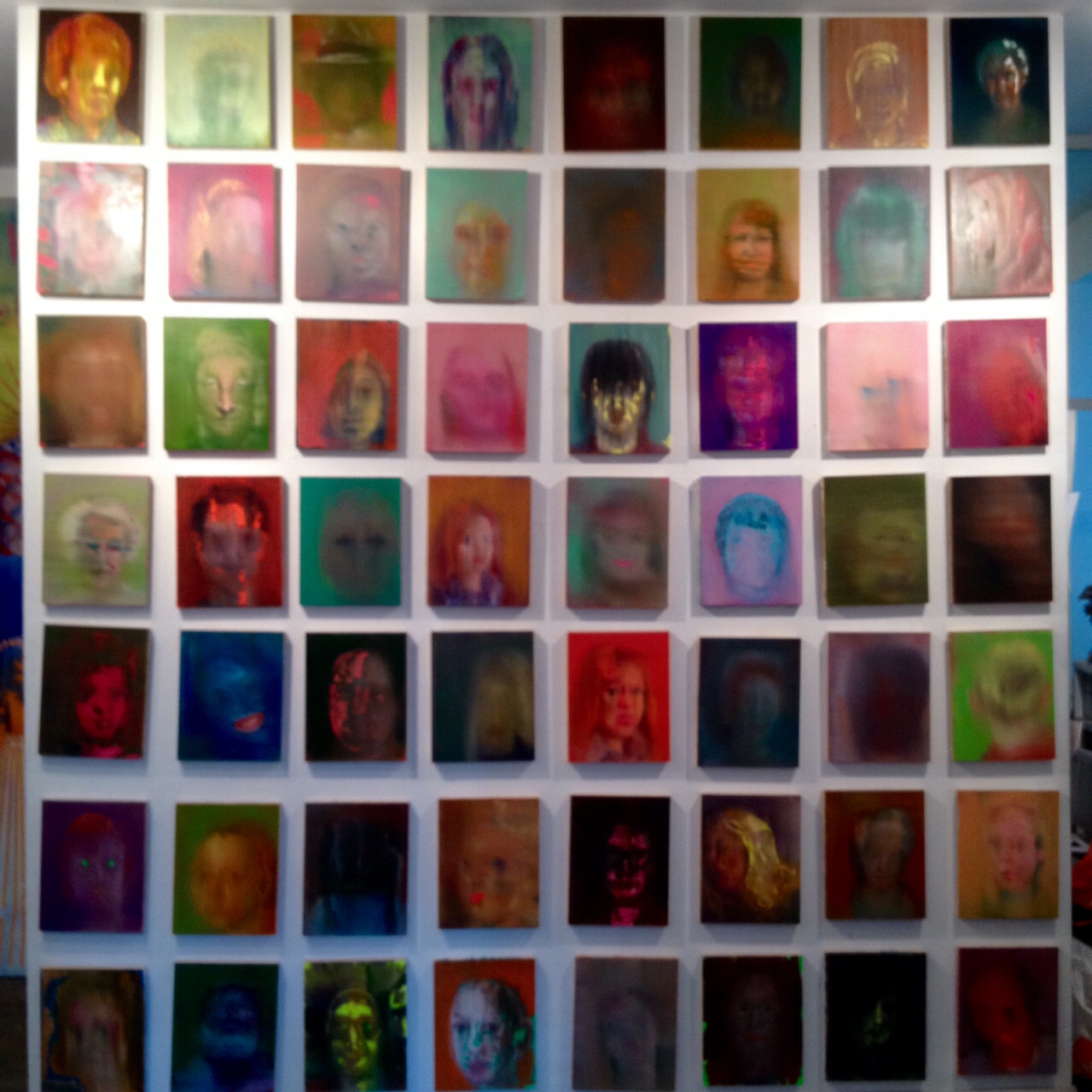
This essay was composed for Liv Mette Larsen’s exhibition catalogue for Concrete Factory / Slemmestad Fabrikker, the artist’s solo show at Trafo Kunsthall in Trafo, Norway. Her show is on view from 6 May to 17 June, 2017. More information about the exhibit and Trafo Kunsthall can be found here. More information about Liv Mette Larsen is on her website, here. Installation image courtesy the artist and Trafo Kunsthall.

Paul D’Agostino, Ph.D. is an artist, writer, translator, curator and professor living in Bushwick, Brooklyn. More information about him is available here, and you can find him as @postuccio on Instagram and Twitter.

Calling All Sorts: Gestures & Junctures, Questions & Quotes

by Paul D'Agostino

Gestures&Junctures-catalog-montage-pic

Calling All Sorts: Gestures & Junctures, Questions & Quotes

One artist’s operative modes, procedural preferences, concepts and contexts, and embedded or openly conveyed metaphors and meanings might be many and varied, and might change significantly over time or from one body of work to the next. Another artist’s perhaps less stratified or ranging approach to artmaking might appear to be far more focused, resolved or streamlined, its ultimate overall yields of ostensibly greater formal or material cohesion.

One artist, in other words, might seem to be all over the place, or to feel most inspired or challenged by working as such, while another might seem somewhat devoted to a specific creative locus, process or directional sense.

One artist’s creative output might look like an explosion. Another’s, hermetic and meticulous.

One’s work might seem nearly nonsensical. Another’s, resolutely rational.

One artist’s personality might be described as Type A, or whatever that’s called these days. Another’s might be described as Type B, or whatever that’s called these days. One artist is introverted, the other extroverted. One is left-brained, the other right-brained. One is instinctive, shoots from the gut. The other painstaking, pensive, cerebral.

And yet, such labels might serve little purpose. Personalities are far more nuanced than such descriptors generally allow, which is particularly true when it comes to discussions of artists—and when considering how and why they do what they do as agents of creative endeavors, as creators of cultural products.

Moreover, artists are rather contrary to being labeled. And rightly so. Who wants to be put in categorical boxes? Artists of all sorts, after all, are the people whose specialty is to think outside of them—much of which derives from posing good questions to answer, and finding good problems to solve.

In other words, to be an artist is to maintain an ever-inquisitive, problem-solving mind and creative disposition. For some artists, this is almost a passive act. For others, a firmly conscious, decisive one. Some artists pose questions and problems in a way that gives them rules to follow. Others throw rules out the window—perhaps even as a rule.

Some of the questions and problems leading eventually to artworks are veiled, implicit, unstated—so inherent to the creative process, even, as to be easily forsaken. For instance:

How would that field look if rendered in watercolors or graphite?

The other aspect of this particular idea about sexuality and art history has never been explored.

Can I carve a cloud with pink lining from a slab of marble?

The art world lacks and therefore needs my parodical video piece on the preemptive museumification of post-nuclear sound art.

Other questions and problems, meanwhile, are explicit, blatant, overt, perhaps even inscribed into the work itself so as to engage a viewer, if not society at large, directly. To be sure, such questions and problems can be of variable complexities, and they might well have no real answers or solutions.

What, then, of all this?

Most simply: It takes all sorts.

All sorts of artists, all sorts of artworks, all sorts of creative personalities, all sorts of approaches, all sorts of introversions and explosions, and of course, all sorts of questions and problems.

What has charmed me the most about working with the inspired and inspiring group of MFA students at Queens College is that they quite literally are, in a collective sense, all sorts. Some work in traditional media and processes, others in advanced technologies and social practice. Some dig into personal narratives and experiences to address complex issues of sexual, racial or national identity; others take creative cues from more directly visual sources, including urban environments, nature and folk traditions. Some seek to create active exchanges with their viewers, or to compel them to regard themselves as ‘other’ to foster understanding; others aim to inform or disarm their viewers by presenting themselves intimately, sincerely, provocatively.

Indeed, the wide range of inputs and pursuits relevant to this group of artists is readily conveyed by the terms they came up with themselves when asked, individually but within a group setting, to try to sum up their respective creative practices in just one word. Here’s what they offered:

chaos, exploration, pattern, connection, empathy, bound, experimental, digestive, emotional, nostalgia, descriptive, poetic, schizophrenic, narrative, weird, understanding, stillness, scientific, cliché, quiet, dignity, hungry

It was from the content of that initial discussion, and from a great many deeply enjoyable and reciprocally enriching studio visits, that I developed the ideas for Gestures & Junctures, Questions & Quotes, an exhibition that I hope does as much to showcase the breadth and quality of the artworks produced by this talented MFA class, as it does to incorporate its viewers into its intermittently audience-inclusive fold. To that end, what you’ll find in the show and in these pages is an array of variably mediated, often interdisciplinarily informed artworks that I have dared to describe loosely as ‘gestural’ and ‘junctural’—created with painstaking care or palpable explosiveness by one of the most driven, creatively variegated groups of art students I’ve ever encountered.

What you’ll also find in these pages are questions these students would like to pose—to themselves and to you—and quotes they’ve selected—for themselves and for you.

And now, for you, a note of advice with which I’ll conclude:

Don’t keep an eye out for these artists. Keep your eyes on them.

________________

The above text is my catalog essay for Gestures & Junctures, Questions & Quotes, an exhibition I curated for the CUNY Queens College MFA Program, on view at Sideshow Gallery in Williamsburg, Brooklyn, from April 7th-30th, 2017. Featured artists: Arbër Dabaj, Alejandro Salgado Cendales, Alix Camacho, Amy Cheng, Edward Majkowski, Effi Ibok, Eliesha Grant, Erin Turner, Floor Grootenhuis, Jeff Kasper, Jenna Makuh, Julian Phillips, Len Antinori, Maria K. Karlberg-Levin, Michael Ferris Jr., Nancy Bruno, Paula Frisch, Pedro Ventimilla, Tara Homasi, Uno Nam, Zaid Islam.

Paul D’Agostino, Ph.D. is an artist, writer, translator, curator and professor living in Bushwick, Brooklyn. More information about him is available here, and you can find him as @postuccio on Instagram and Twitter.

Radiantly Provocative

by Paul D'Agostino

Untitled (Target, Ripple and Zig Zags) 2016

Rico Gatson, Untitled (Targets, Ripples and Zigzags), 2016. Image courtesy the artist and Ronald Feldman Fine Art.

 
Radiantly Provocative: Rico Gatson’s Power Lines

Robustly chromatic, visually potent, at times compositionally labyrinthine and physically imposing, Rico Gatson’s mixed-media paintings, sculptures and collage-centric drawings are always, thanks in part to their carefully honed economy of forms and means, declarative, assertive and indelible—and unmistakably, unwaveringly his. On levels aesthetic and conceptual alike, Gatson does not imbue, but rather inundates his works with definitive, invariable force, executing them with just enough colorful vibrancy, linear keenness and mystical curiosity as to allow his viewers to almost—yet only almost, and this is crucial—miss or overlook their certainly important, equally cogent, subtly layered, variably strident socio-political content.

All of this has been true of Gatson’s work for quite a while, but it is now much more so in the new series of mixed-media pieces he has produced for Power Lines, a solo exhibition at Samsøn Projects. The artist’s characteristic palette of patently Africana-associative chromatics—bright reds, greens and goldish yellows often framed, interrupted by or sectioned off with swaths of deeply flat or slightly lustrous blacks, all arranged in variable abstractions that might even, at times, feature embedded texts—has become bolder, brighter, richer and punchier than ever, and thicker sections of color and black alike make his compositions register as weightier, more declarative, somehow exigent. Some pieces, however, especially a fresh new series of small panels, as well as certain tall, lean-to like sculptural works, Panel Paintings, evidence Gatson taking a bit further his recent explorations of chromatic switchings—transposing the complementary balancing he usually achieves via reds and greens with value-like harmonies via purples and greys, maintaining his lush warm yellow to keep the violets at bay.

Gatson’s recent boundary-breaching explorations hardly stop at color swaps, however, and it is in some of his newest compositional tweakings that viewers are reminded to look very deeply into the information he’s providing to extract therefrom certain latent, open-endedly abstract statements regarding contemporary race relations. What does a small panel covered in colorful dots mean, for instance, when it’s formally disrupted by a veil of orderly black lines from one end to the other? In the artist’s series of ‘fun-looking’ Panel Paintings, what might it mean for so many Africana-colored pieces to be ‘infringed upon’ by one that is simply, and thus in some sense openly, black and white? Such compositional and installation-related choices bring viewers into more intimate closeness with the objects in question, for certain, encouraging them to decode those featuring formally obscured texts, for instance, or inlaid images. But are viewers looking at them enough to look into them? Are they really, on a certain level, reading them? This is indeed the self-reflexive crux of the matter in Power Lines: Are we truly and honestly—as viewers of art, or as a populace with presumed awarenesses—reading the racially relevant signs that are all around us? Within the context of Gatson’s work, are we actually reading, for instance, the collaged bits of generally civil-rights-era imagery he has been inserting with increasing pervasiveness across his œuvre? Are we pausing to consider that the ever-bright colors in his paintings are achieved with simple domestic paints, thus making their presence an oft-overlooked omnipresence, and granting their flatness not just visual frankness but also critical candor?

Gatson’s chromatico-formalisms are more blatant than ever in Power Lines, and the blatancy, boldness and volume of his sociocultural critique is markedly amped up. The artist has long posited his work as a platform for discussions of racial inequalities, and his voicings of the same, in his new body of work, now have notes of stridency. He now seems to be demanding for his work to be regarded as such. And now is a crucial time for us to regard it thusly, for these discussions have been heating up dramatically in so many places, on so many fronts. To be sure, the best way to cool the temperature of the debate would be to actually engage in it, actively and honestly. With Power Lines, Gatson seems to be putting himself forth as a moderator.

In the context of all this, then, it becomes very intriguing to take a closer look at the series of Radiant Icon collage-drawings that Gatson has been making for years and years, and of which he presents a new suite here. That is, in the context of Gatson’s recently amped-up volumes and greater formal overtness, it becomes clear that the artist has been waiting for these discussions to burst open for quite some time. In our faces all the while—now latent, now strident—have been his powerful, colorful, radiantly provocative lines.

Untitled (Three Diamonds) 2016.jpg

Rico Gatson, Untitled (Three Diamonds), 2016. Image courtesy the artist and Ronald Feldman Fine Art.

________________

This essay was composed as an accompaniment to Power Lines, Gatson’s solo exhibition at Samsøn Projects in Boston, MA. The show opens on June 3rd and runs through July 17th, 2016. More information and images here.

Paul D’Agostino, Ph.D. is an artist, writer, translator, curator and professor living in Bushwick, Brooklyn. More information about him is available here, and you can find him as @postuccio on Instagram and Twitter.

Kin and Not

by Paul D'Agostino

Image courtesy Mille Kalsmose.

Image courtesy Mille Kalsmose.


Kin and Not: Mille Kalsmose’s Substitute Families

Mille Kalsmose probes and mines the definitively trying, variably traumatic aspects of her own familial history to question interpersonal relationships, social mores, maternities and paternities, kinships and kindredness, filial similarities and otherness, and the differently meaningful strangeness of strangers as they embed themselves into our lives as friends and acquaintances. Whether her works assume form as installations, photographic series, sculptures or broadly variant visual essays, they amount collectively to so many investigations of the ethical, physical, existential and socio-spatial malleabilities of our regards for one another, related or otherwise—as well as our regards, both obliquely and directly, for ourselves.

In her newest body of work, Substitute Families, Kalsmose expresses the presumed rigidities and sometimes veiled fragilities of familial rapports through materials and selective placements. Crafted out of iron, wood, silk and pigskin, this sculptural series consists of a number of very similar individuals qua family members of variable heights and spatial relations to one another. Hard and heavy, the iron elements are at once the individuals’ bodily sticks, cranial frames and standing perches, as each figure appears in several forms, suggesting perhaps maturation and the passing of time. Delicate and liminal, and stretched taut into their iron frames—then fastened firmly in place with most visible, ‘rigidity’-implying rivets—the silk and pigskin elements make up certain body parts and facial forms. As these features grow and ‘age’, they eventually become the iron-bound wooden templates that gave them form, to some extent, in the first place.

Bereft of truly individualizing features—although certain shapes do suggest that one might be a little girl, another a boy, others parents— these standing figures scan as curiously looming stand-ins for some sort of ambiguously ‘related’ collective. At once human-like and not at all, they are markers of the subtle individualities and samenesses that define us not only as beings, but also as groups, and their differential proximities to one another leave viewers pondering their interpersonal intimacies, closenesses, distances. They might be a family properly-so-called; they might be a family only circumstantially; they might not necessarily be a true family at all.

Are they facing toward or away from one another? Are they coming together or cleaving apart? These figures’ formal simplicities and spatial suggestivities leave them posing splendidly unanswerable questions of ethical, philosophical, socio-cultural and psycho-familial sorts. At the same time, viewers might simply find them pleasant objects to look at, walk among, be around. In a way, we all hope to be a bit like that, too, sometimes.

Image courtesy Mille Kalsmose.

Image courtesy Mille Kalsmose.

________________

This essay was composed on the occasion of Kalsmose’s Substitute Families series being included in Afterimage, a group exhibition at InCube Arts, located at 314 West 52nd Street in New York City. More information here.

Paul D’Agostino, Ph.D. is an artist, writer, translator, curator and professor living in Bushwick, Brooklyn. More information about him is available here, and you can find him as @postuccio on Instagram and Twitter.

In : Out :: / Out : In ::

by Paul D'Agostino

_Caput_ _Procedure_ invite


In : Out ::

In, inward, into, within, endogenic, ingressive, inside: Many are the modes and forms of inner-tending, variably interiorizing terms and motilities that one might associate with Tom Butter’s artworks. His paintings and sculptures alike are wont to turn, gyrate and churn, at times toward real or implied centers—the paintings, via gestural strokes, directional linearities and compositional flow; the sculptures, via a range of generally less-than-presumable yet ever-plausible, sometimes aberrant or amusingly jarred kinetics that seem now barely centrifugal, now subtly centripetal. With all their flux and functional switchings, with all their ins and outs, Butter’s works could perhaps quite nearly, not unlike certain prepositional analogies, engorge one another, then devour themselves.

A most peculiar, mechanically genial, bizarrely balanced, disturbingly jocular and behaviorally confounding sculpture is Caput, a piece whose apparently simple, somewhat centripetally erratic motion would be consistent if it weren’t for the friction of certain surfaces, the presence of certain finishes, the interference of a wall, the tensile resistance of a twisting, force-conveying metal belt, and the irregular form and considerable mass of a captivatingly piece-capping albeit floor-bound wooden ball. Caput’s spasmodic motion is its function, its spasmodic function is its motion, and since both are intermittently stunted, thwarted and blunted like the day is long, the piece’s repetitive yet not fully predictable comportment makes it not merely uniquely Sisyphean, but also an exquisite commentary on being and becoming, on doing and making, on trying and conceiving, on coming and going, on failing and flailing, on flunking and clunking—not to mention on the useful futility, or futile usefulness, of tedium. Caput is the anachronistic Caput Mundi of a busted world, perhaps, or perhaps it’s so captive to its inherent natures that it eludes or precludes its own usefulness, purpose or success. It is also, in a way—as a spiritedly animated object, or as an ersatz pet—quite adorably pathetic, simpatico, endearing.

There is something affirmatively friendly about Caput, in other words, an observation of indirect relevance that makes broader formal sense, nonetheless, when it’s considered in an expanded context that would include, also, a painting called Procedure, a companion work of sorts whose linear arcs and compositional dependencies between spatially disparate, energetically bundled forms display just enough visual analogousness to make the pieces appear readily kindred. Procedure, however, thanks in part to the placid qualities of its subtle pinks, greys and variably striated compositional horizontalities, reads like a realm of resolve, repose, relief or release, or perhaps even, at some remove, salvation—metaphysical, merely material or elsewise. Between one wall-knocking of its head, as it were, and another, Caput itself might dream, and dizzily so, of retiring to Procedure’s sphere of fluidity, quiescence, calm.

But then Caput’s mechanical condemnation kicks comically back into gear. And there it goes all over again—spinning itself, clubbing itself, lugging itself up some implied hill of numbingly eternal cumbersomeness. It gives in to itself, knocks into its surroundings, struggles inward for something, yet also for naught. If only there were, as it were, a clear way out.

— 502 :


_Working_ _Core_ invite


Out : In ::

Out, outward, out of, out from, exogenic, egressive, outside: Many are the forms and modes of exteriorizing, variably outer-tending motilities and terms that one might associate with Tom Butter’s artworks. His sculptures and paintings alike are wont to churn, gyrate and turn, at times away from real or implied centers—the sculptures, via a range of ever-plausible yet generally less-than-presumable, sometimes amusingly jarred or aberrant kinetics that seem now barely centripetal, now subtly centrifugal; the paintings, via compositional flow, directional linearities and gestural strokes. With all their functional switchings and flux, with all their outs and ins, Butter’s works could perhaps quite nearly, not unlike certain prepositional analogies, devour one another, then engorge themselves.

The resting state of the painting Core is, by and large, hardly restful at all. Rather, it is restive, tumultuous, turbid and roiling, a primarily bright-orange convulsion that might be a sort of geological extrusion, or a fulgor or flare dancing about eruptively on some distant astral surface, or a writ-large close-up of a wee little blossom, or perhaps just a heaving, surging, stirring chromatic effulgence. A certain darkness, however, in Core’s lower right register seems to hint at an interior otherness, or an unknowable beyond or subsurface pitch, or a titularly relevant central force that serves to dial the composition’s frenzy down a notch. What’s more, a rather curiously string-like line, also quite dark, darts up and curves down from one side to the other, a loose girding or spatially placeless garland of sorts that makes of so much stridency something ultimately melodious.

In formal harmony with that very line, then, is a meticulously braided circuit of pink twine that truly does gird loosely, in veritably garland-like fashion, the relatively circular upper portion of a sculpture called Working, a piece whose consistent, delicate, somewhat peaceful rotation is just deliberate enough to suggest potential centrifugality, and whose terrifically haunting, perhaps haunted gloves—because handless, because armless, because body-less, because worker-less—locked firm into a torqued, wrenching grip around the structure’s central axis, are at once a hint that something in the ‘works,’ or in the ‘workings’, has gone significantly awry, and a focalizing synecdoche for all the toil, ache and struggle that go into conceiving, creating, ‘working on’ and making things. The ‘work’ at ‘hand’ in Working is repetitive, in a way, yet not redundant; it is visually tangible and spatially present, even if also, in a structural sense, only barely there. The implied welder whose means of manual protection have been abandoned was flung away, perhaps, when Working’s slow spin went rogue-fast for an erred moment, or the ‘worker’ has gone missing for some other unknowable reason—and he remains the machine’s inherent secret, its enigma, its ghost.

Working worked its worker to the bone, worked him all the way away. As a viewer, a somewhat empathically disarmed one at that, you become one with this phantom’s wearied body in his phantom space. As he, too, might have—or still might—you might wish that the machine would invite you in.

— 502 :

________________

These essays were composed as accompaniments to Tom Butter’s solo exhibition, In : Out :: Out : In, at Studio 10 Gallery in Bushwick, Brooklyn. The exhibition opens on the evening of 2 January 2016, from 7-9pm, and runs through 31 January. More information here.

Paul D’Agostino, Ph.D. is an artist, writer, translator, curator and professor living in Bushwick, Brooklyn. More information about him is available here, and you can find him as @postuccio on Instagram and Twitter.

Images featured in this post are courtesy Tom Butter. For more information about him and his work, visit  www.tombutter.com.

Studio Visit: Barbara Friedman

by Paul D'Agostino

Barbara Friedman in her studio in downtown Manhattan.

Barbara Friedman in her studio in downtown Manhattan. Click on images in this post for larger views.

Barbara Friedman’s broadly expressive depictions of often comically collared, sometimes art-historically identifiable someones are certainly no less, and perhaps a great deal more, than parodically unsettling decapitations of the tradition of portraiture—a tradition that might be considered questionably moralizing, on the one hand, and formally deterministic, on the other—all rendered aesthetically pleasing, and freshly so, by virtue of the artist’s preference for palettes beaming with surprisingly saccharine subtleties, and for now jarred, now divisively defined, now calmly considered compositions and applications.

Friedman.5

All the same facets of Friedman’s works render her parodical decapitations all the more uniquely, curiously unsettling.

And all the more splendidly amusing.

And all the more, in a word, bizarre.

And bizarrely hard to shake.

Like the hint of terror in a rumble of maniacal laughter—even if its source, however creepy, is harmless.

At any rate, here are a few more images of Friedman’s works to jar, confuse and amuse you. Indulge in her gleaming whites, conflagrant oranges, sugary pinks and lustrous blues.

And perhaps listen close for a peculiar cackle.

Friedman.2
Friedman.4
Friedman.3

Studio Visits: Spring Breakers at NYSS

by Paul D'Agostino

David Gayle's studio.

David Gayle’s studio.

Over the course of the semester thus far, we’ve discussed and workshopped many artists’ statements, brief critical texts and, most recently, MFA thesis outlines and drafts during our writing sessions at the New York Studio School of Drawing, Painting and Sculpture.

Following one of our recent gatherings, a small group of us took advantage of the school’s relatively calm corridors and tranquil airs—it was spring break, otherwise the premises would’ve been far more abustle, especially as students are now gearing up for final shows—to do a round of studio visits.

Lenka Curtin's studio.

Lenka Curtin’s studio.

We went to Lenka Curtin’s studio to see the newest pieces in her family of ethereally inspired yet materially robust, indeed almost perplexingly multi-media sculptures, the collective of which is becoming increasingly suggestive of things Nature herself might see, perhaps, when she dreams. We also looked at Rachel Rickert’s new sequence of paintings, most of them still in-process, that at once capture, expand, re-delineate and sympathetically document most every corner of her current living quarters to question notions of home, safety and comfort as they relate to body, light and space.

Rachel Rickert's studio.

Rachel Rickert’s studio.

Tightly tethered, as well, to notions of space and home, interiors and exteriors, inside-self and outside-self—albeit due to, and sometimes placed within, quite differently restrictive, constricted contexts—are David Gayle’s pensively figurative, nimble works in various styles and mediums, a mere handful of which we had a chance to look at. We also went to the studio of Katelynn Mills, whose mixed media paintings, many of them generously textured with strata of sparely chromatic encaustic, pertain to breaking up or tearing into ideas of composition within two-dimensional spaces—so as to then find formal means for mending them.

Spring break is over, so I’m sure the studios and halls over at NYSS are anything but tranquil these days.

And that’s good, they shouldn’t be.

At least not all too often.

Katelynn Mills's studio.

Katelynn Mills’s studio.

Studio Visits: New York Studio School

by Paul D'Agostino

One of Ana Portela's variably veiled works.

One of Ana Portela’s variably veiled works.


After Fran O’Neill asked me to give a talk about my artwork and curatorial practices at the New York Studio School several weeks ago, I had the honor of being invited back to spend an afternoon doing ‘open critique’ studio visits with a number of students whose bodies of work are distinct and diverse from one another in terms of materials employed and formal approaches alike. Here are some images of studios and works that I had a chance to look at and ponder, accompanied by some observations I put together in longer ponderings thereafter.

Katelynn Mills in her studio with some recent works.

Katelynn Mills in her studio with some recent works.

Perhaps more of a canvas-bound interventionist than merely a painter, Katelynn Mills makes visceral, very literally manually executed pieces that are matters of wounding and healing, tearing open and concealing, nurturing and suturing.

Adrianne Lobel in her studio.

Adrianne Lobel in her studio.

Adrianne Lobel in her studio.

Adrianne Lobel in her studio.

Adrianne Lobel, in her variably scaled renderings of empty parking lots, lone delivery trucks and desolate storage facilities, creates compositions full of exuberant light and quiet charm out of what one might otherwise regard as perhaps rather overlookable suburban mundanities. Their loss, Lobel would indubitably maintain—and her gain.

Ana Portela, the only artist I met with working primarily in sculpture—though she’s also been tinkering with a series of drawings turning her sculpted three dimensions back into two—cloaks figure-like yet mysteriously vague forms with multi-media overlays splayed out in classically indicative, momentarily marble-suggestive furls and folds, at once veiling her subjects and subjectifying her veils.

Portela's studio.

Portela’s studio.

Jack King in his studio—with his new muse.

Jack King in his studio—with his ‘new’ muse.

In their shared studio space, Jack King and Darrell Hostvedt work through and against prior careers and professional practices in very different yet equally effective ways. King, inspired by photographic images—sometimes his own—and impressionistically informed palettes, taps into memories and emotions in a way that now channels, now challenges certain convictions he had honed and intoned during his long academic career in psychiatry. What’s more, he has also recently located his true artistic muse in an old wooden chair that has become a synecdochic embodiment not only of his grandmother, to whom the chair once belonged, but also of a vast trove of associations and memories through which he can pick for depictions. Hostvedt, meanwhile, after working in construction for many years, now finds himself peering further and further into detailed segments of a particular landscape to extract its constituent forms, thereby deconstructing a certain glimpse of natural objects to then render them back into larger compositions in watercolor—at times building back onto them with reconstructive, collaged additions.

Darrell Hostvedt with a recent work.

Darrell Hostvedt with a recent work.

A glimpse inside one of the nooks in Jacobs's studio.

A glimpse inside one of the nooks in Jacobs’s studio.

Laura Jacobs, finding herself quite literally overwhelmed with spatially charged inputs and insights upon moving into her quaint, quirky, warmly lit and brilliantly many-windowed studio—a most peculiar cranny within the New York Studio School dubbed Guston’s Kitchen, for reasons that are likely quite clear—traces, molds, reiterates and re-renders her deeply curious surroundings like an archaeologist, an archivist, a narrative-seeking dramaturge in the midst of an ever-shifting stage. While Jacobs used to work in set design, it seems she’s now situated such that a certain set seeks to design itself into her work.

Finally, Stephen Walsh, a painter and draughtsman who knows well the challenges of harnessing abundant light and formal beauties from time spent in Italy, makes his most successful paintings when he is able to work against his own skills in drawing, in a way, such as in his recent treatment of the biblical narrative of the Annunciation, a work that’s quite readily audible in its silent splendor—and thus splendidly fitting for its spiritual context.

Stephen Walsh passing before his treatment of the Annunciation.

Stephen Walsh passing before his treatment of the Annunciation.

Studio Visit: Pamela Butler

by Paul D'Agostino

Pamela Butler in her Bushwick studio.

Pamela Butler in her Bushwick studio.

Comprising installations, paintings, collages, sculptures and drawings, some of them scaled large for window displays, as well as text and video pieces, Pamela Butler’s artwork is, in strictly material terms, densely layered. Her layering is also conceptual, however, entailing strata upon strata of feminism-inflected sociocultural critique—from gender discourses and body politics to issues of ethics, socioeconomic disparities, broadly societal shortcomings and common, mundane anxieties.

Layered, stratified, dense. There is a definitive gravity to Butler’s reflections of the world around her.

Nonetheless, Butler’s point of view is that of a regard, not a glare. She channels her observations and commentaries constructively, artfully, not derisively. Her reflections read more like refractions. Her opinions are apparent—or at least intuitable, surmisable—but never so blatant as to give viewers the whole story.

Pamela Butler 2

Again, her art is about the layers. Or her art is to be located therein.

More simply, perhaps, layers are her art.

From beauty pageant contestants to astronauts, from traditional tropes of femininity to contemporary representations of women in mainstream media, from meditations on ‘female art’ to evocations of women’s variable presences and absences throughout art history, Butler’s subjects are at once generally recognizable and close to her heart, both overtly public and essentially personal.

Much of what we talked about when I visited her studio pertained to notions of the body—as object, as idea, as container, as surface, as malleable, as regularizable, as regulatable.

Such notions, much like Butler’s artworks, are densely layered. Not unlike the dermal tissues that encase and protect our physicality.

So much talk of all of the above brought to mind a passage a philosopher friend of mine, Andrea Borghini, recently passed along. It’s from Imaginary Bodies: Ethics, Power and Corporeality, by Moira Gatens (Routledge, 1996). Here she discusses Spinoza’s views on the divisions and sutures between mind and body by positing the latter as the “ground of human action”:

The mind is constituted by the affirmation of the actual existence of the body, and reason is active and embodied precisely because it is the affirmation of a particular bodily existence. Activity itself cannot be related especially to body, mind, nature or culture, but rather to an understanding of the possibility of one’s participation in one’s situation as opposed to the passive ‘living’ of one’s social, political or even brute existence. This active understanding does not, and could not, amount to the mental domination of a body-machine, since thought is dependent for its activity on the character of the body and the manner in which, and the context in which, it recreates itself.

I’ll close with that.

Thanks, Pam. Thanks, Andrea. Thanks, Moira.

And thanks, Spinoza.

Pamela Butler 3

Schizzo: Shores

by Paul D'Agostino

From a series called "Partenze." Mixed-media drawing on card stock.

From a series called “Partenze.” Mixed-media drawing on card stock.

.                           .                           .

.                           .

.

Shores

Caution, no.
On the side of trust
is where one has often erred.
Where one will continue to err
until skies themselves come slumbering
down, until grounds themselves
yawn wide open.

Count on the sun, meanwhile,
to continue to greet you.
And on the moon, too,
to persist in tugging waves to shores
bearing perils, treasures and
the reliable pleasure of that
pure, familiar noise.

.

.                           .

.                           .                           .

From a series called "Partenze." Mixed-media drawing on card stock.

From a series called “Partenze.” Mixed-media drawing on card stock.

Artwork & text, P. D’Agostino